fp-logo-case-03

The Studio that addresses all your Pilates & Movement Needs

  • Logo Design

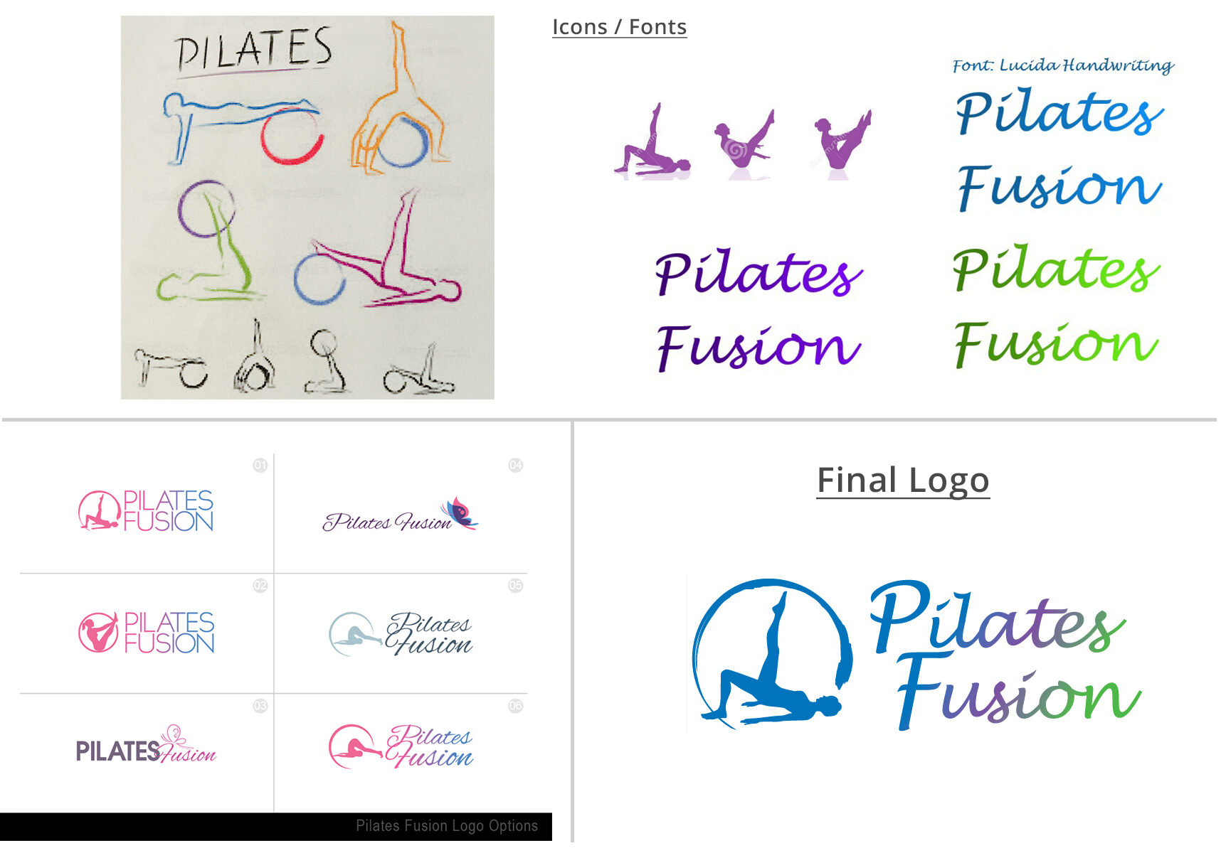
Wendy wanted to capture her core business, Pilates, in grandient colours, as part of her logo.  Healthy Digital suggested a range of colours and pilates excercises for consideration.  Though iterations and refinements of the proposed concept, Healthy Digital delivered a logo Pilates Fusion now love.

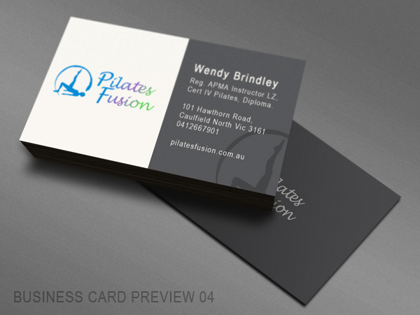
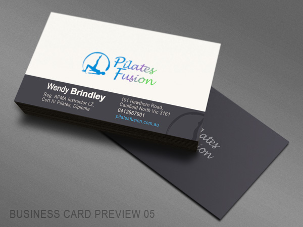
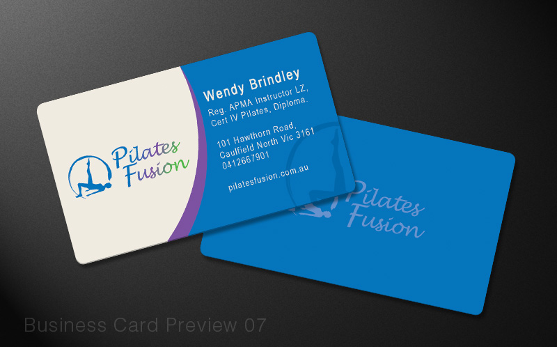
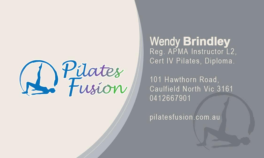
  • Business Card

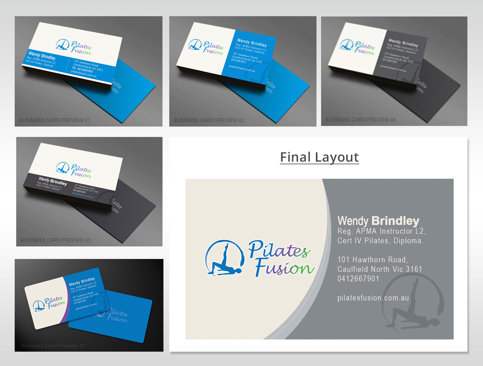
Healthy Digital used the dominant colours from the logo to design a range of simple business card options for Pilates Fusion to consider.

  • A5 Flyer

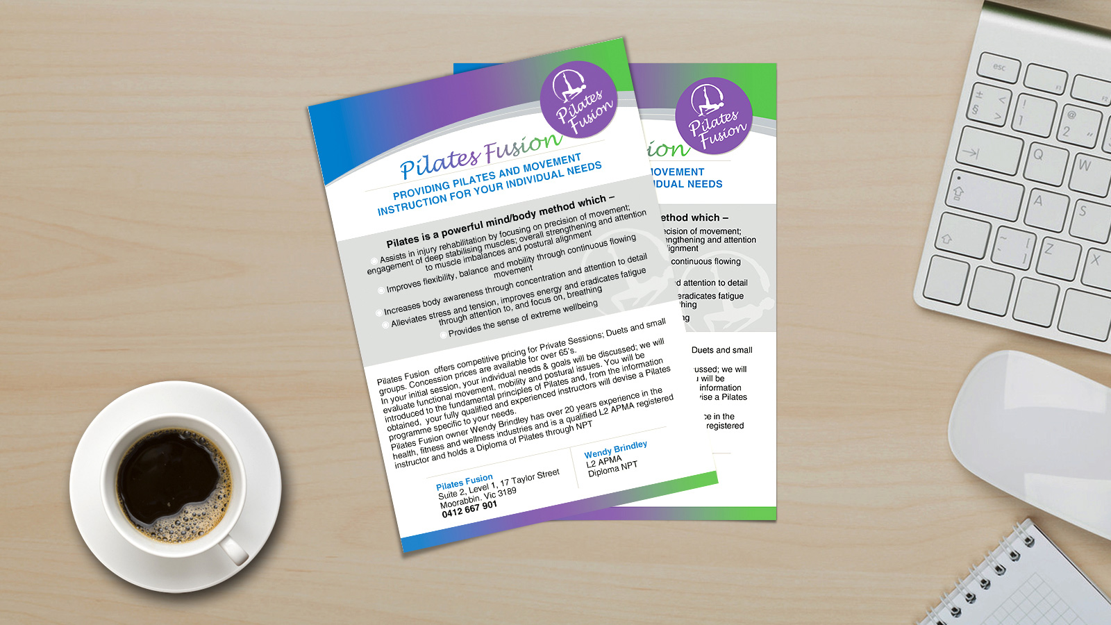
Pilates Fusion required an A5 flyer to use as hand-out to doctors and other allied health providers.  Healthy Digital prepared various concepts, both with and without imagery.  The concept was refined until Wendy was 100% happy with the end result.

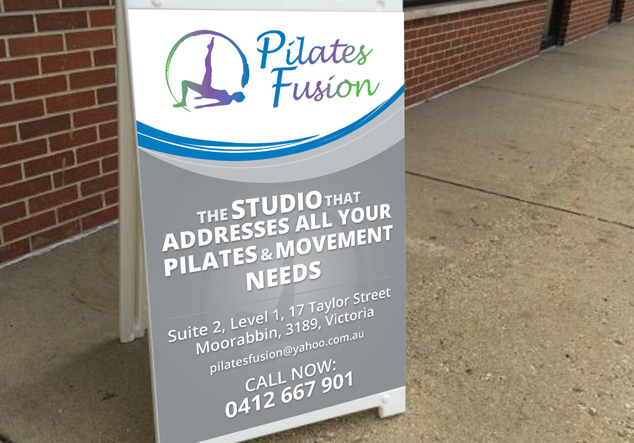
  • A Frame

In an effort to attract users from the street, Healthy Digital prepared an A-frame design which has since been utilised on the pavement outside the studio.

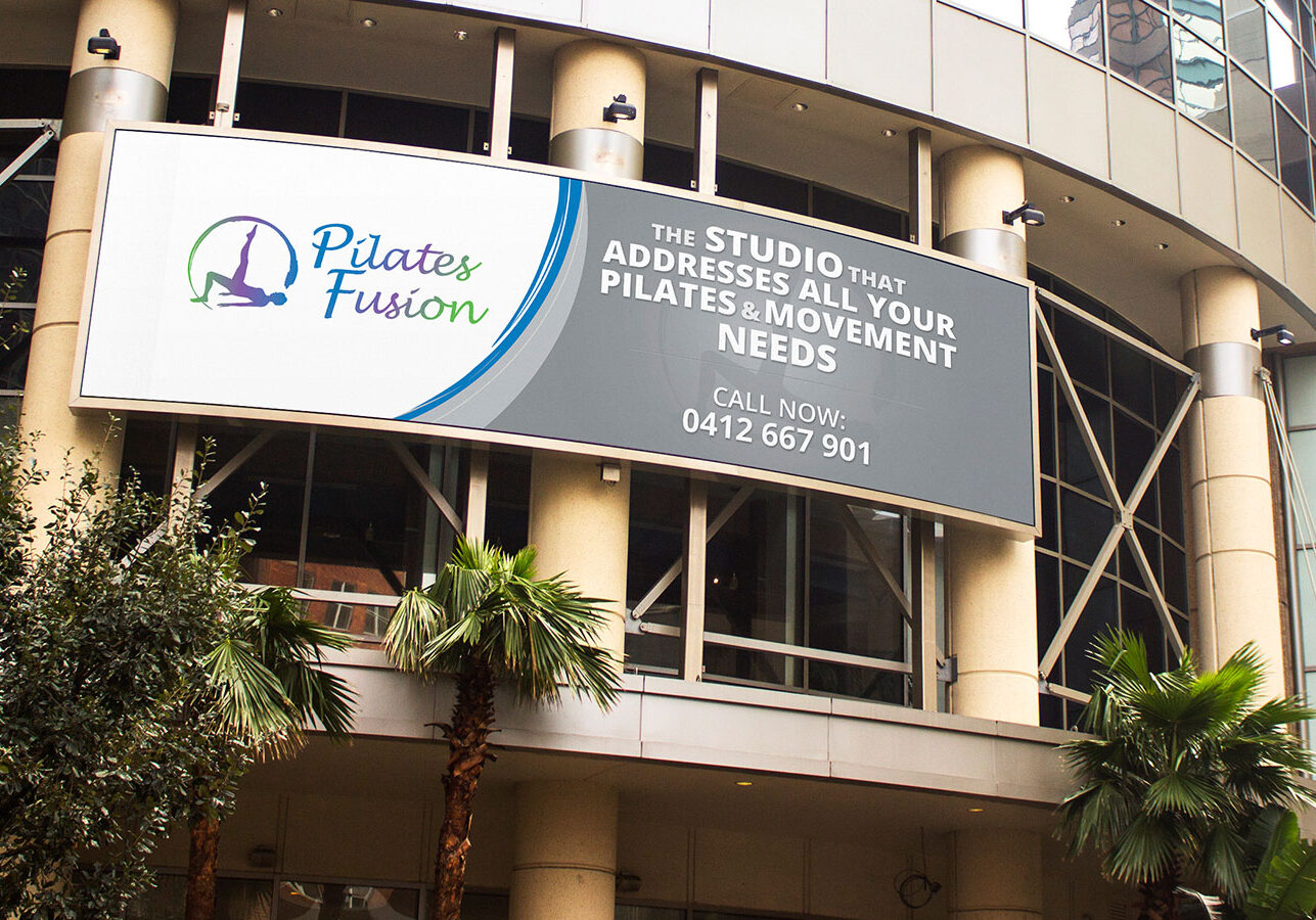
  • Billboard

Healthy Digital prepared a bill board design to advertise the studio to passersby travelling through the city.

How did the client rate us?